
A designer-worthy home rarely comes from expensive purchases alone. What creates that elusive “pulled-together” look is a sequence of decisions—measured, layered, and intentional—that most people never see. These interior design secrets are less about mystique and more about method: how professionals think, what they prioritize first, and which shortcuts are worth taking. If you have ever wondered why some rooms feel calm and complete while others feel slightly off, the answer is usually hiding in planning, proportion, and restraint.
The Interior Design Secrets Professionals Don’t Always Tell You
Understanding What Designers Really Do Behind the Scenes
The difference between a decorator and an interior designer
Decorators primarily refine what you see: furnishings, accessories, color coordination, and surface-level styling. Interior designers go deeper, often shaping how a space functions by addressing layout, circulation, lighting, and the relationship between architecture and furniture. That distinction matters because many “common interior design mistakes” happen when styling is attempted before the room is properly planned. A beautiful sofa will still look wrong if the scale is off, the walkway is cramped, or the lighting is inadequate.
Professionals also think in systems. They define the room’s purpose, identify constraints, and then make aesthetic choices that support those decisions. If you want professional interior design tips that translate to real life, start by treating your home as a set of functional zones rather than a collection of objects.
How designers actually plan a room before buying anything
Designers begin with measurement, not mood boards. They document wall lengths, ceiling height, door swings, window placements, and outlets. Next comes a “program”: what needs to happen in the room—reading, entertaining, working, storage, or media viewing. Only after these fundamentals are set do they develop a concept, palette, and purchasing plan.
One of the most useful home styling tricks is to borrow this sequence. Create a simple floor plan (paper is fine), mark circulation paths, then list what the room must contain. This prevents impulse buying and makes it easier to choose furniture that truly fits. It also makes “small space design ideas” far more effective, because space-saving is usually a planning problem before it becomes a shopping problem.
How Pros Choose Colors, Materials, and Finishes
The “70-20-10” rule for perfectly balanced color schemes
Professionals rely on structure when choosing color. The 70-20-10 rule remains a dependable framework: 70% dominant color (typically walls, large rugs, or major upholstery), 20% secondary color (curtains, accent chairs, painted furniture), and 10% accent (art, pillows, objects with punch). It is not meant to be rigid, but it prevents a palette from becoming chaotic or flat.
If you are learning how to choose paint colors, begin by selecting the dominant tone based on the room’s light exposure and the mood you want—warm, cool, airy, or dramatic. Then use the 20% layer to build depth, and reserve the 10% for contrast. This approach also makes changes easier: updating the accent layer can refresh a room without repainting or replacing major items.
Hidden tricks for mixing metals, woods, and textures like a pro
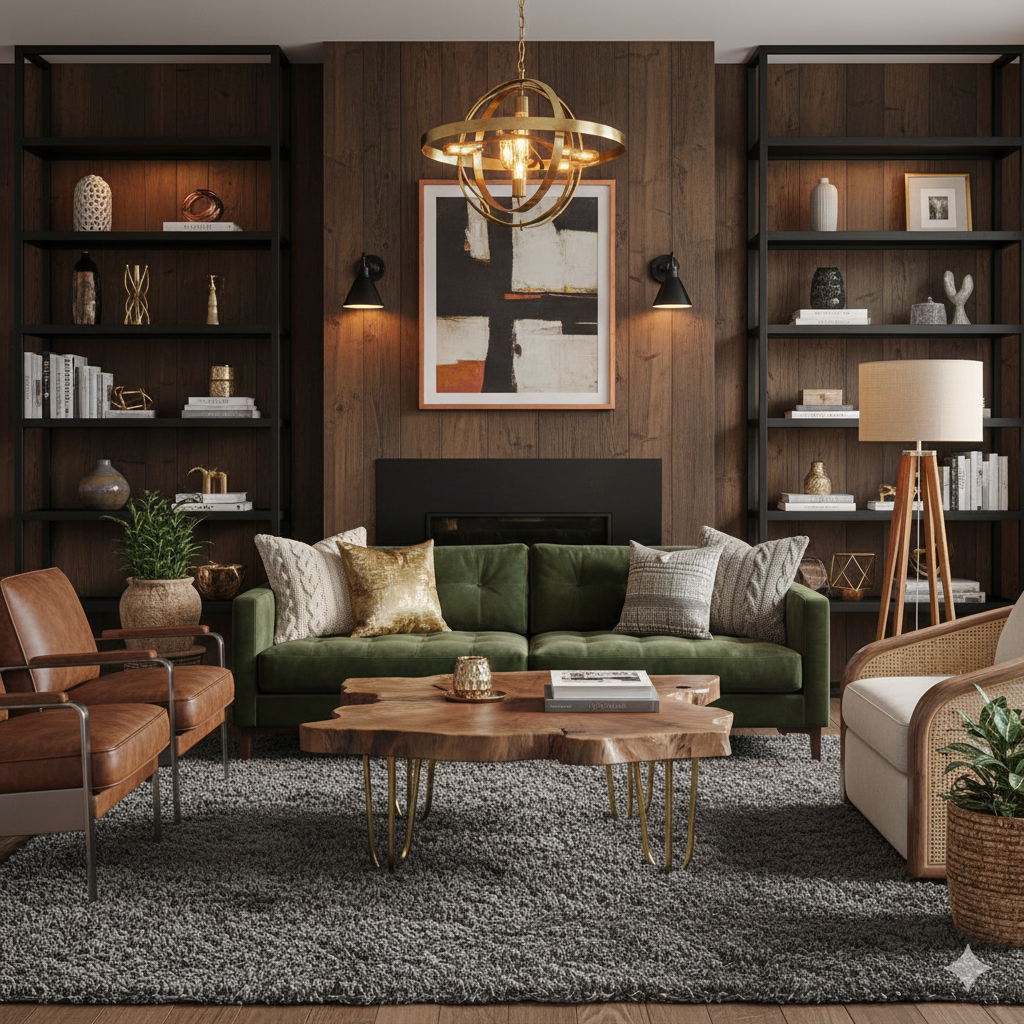
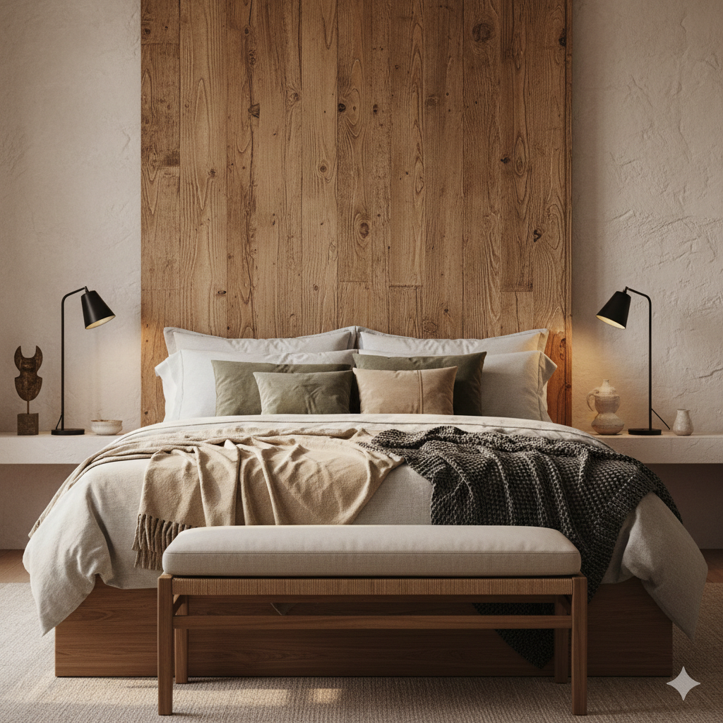
Mixing finishes is less about rules and more about distribution. Designers repeat each finish at least twice—often three times—so nothing looks accidental. A brass sconce feels intentional when brass reappears in a frame, a tray, or cabinet hardware. The same applies to wood tones: a walnut table pairs better with walnut echoing elsewhere, even subtly, in picture frames or a lamp base.
Texture is the quiet sophistication behind many interiors that photograph well. Aim for contrast: matte with glossy, nubby with sleek, crisp with plush. A room of all smooth surfaces can feel sterile, while too many heavy textures can feel visually loud. The professional move is to create a hierarchy: one dominant texture (for example, a wool rug), supporting textures (linen drapery, wood grain), and one or two refined highlights (lacquer, metal, glass).
Layout, Space Planning, and Flow Secrets Designers Rely On
How Professionals Plan Furniture Layouts for Real Life
Traffic flow rules designers use (and how to apply them at home)
Good rooms are navigable. Designers protect circulation first, then place furniture. As a baseline, allow clear pathways through primary routes and avoid forcing people to weave around corners. Common targets include generous walkways in living areas and unobstructed access to doors, windows, and key storage. When circulation is compromised, even expensive furniture can feel awkward.
To apply this at home, identify the room’s “desire lines”—the natural paths from entrance to seating, seating to windows, and seating to adjoining rooms. Keep those lines open. If you need to place furniture near a passage, choose pieces with lighter visual weight (open bases, slimmer profiles) so the room still breathes.
The “no-fail” formulas for arranging sofas, chairs, and tables
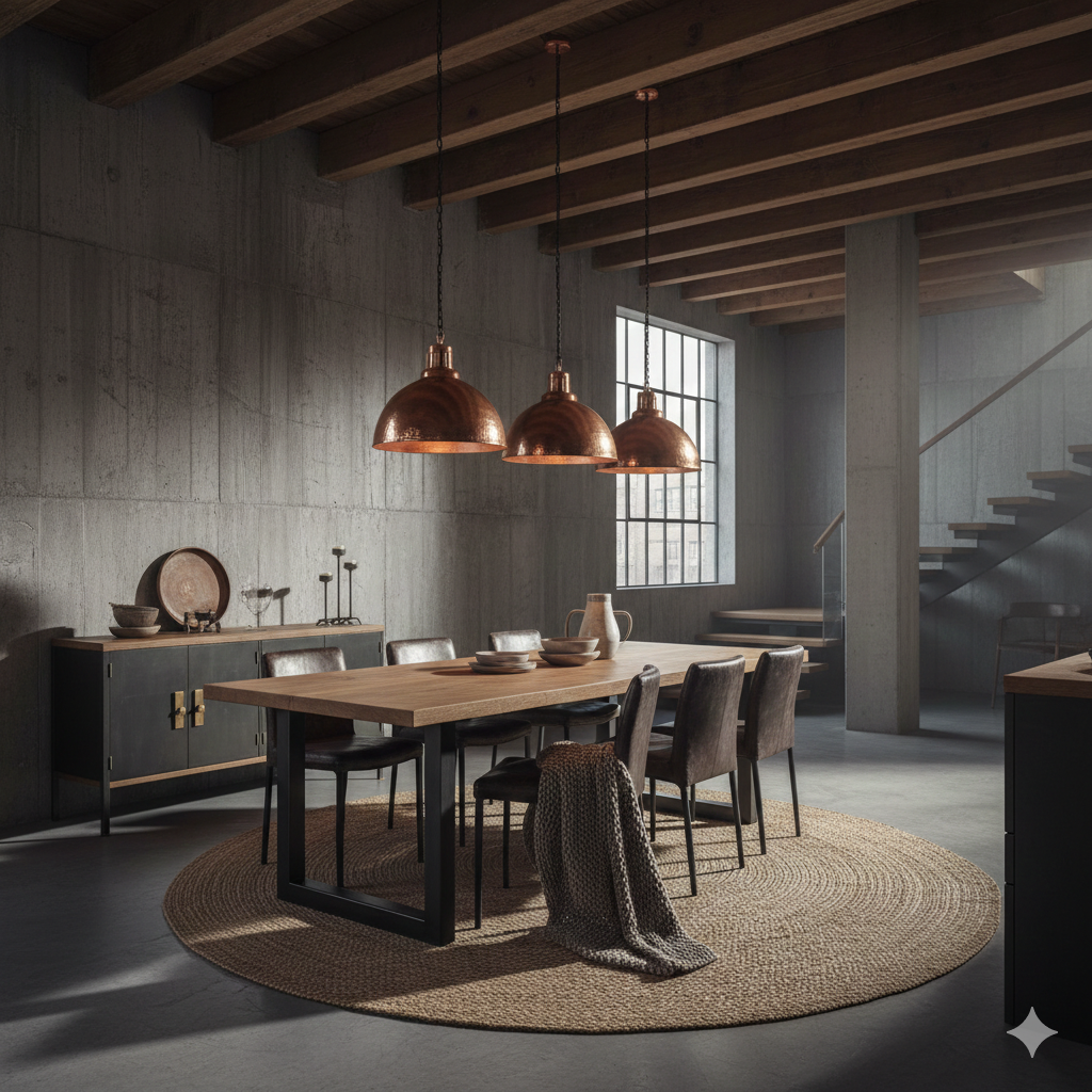
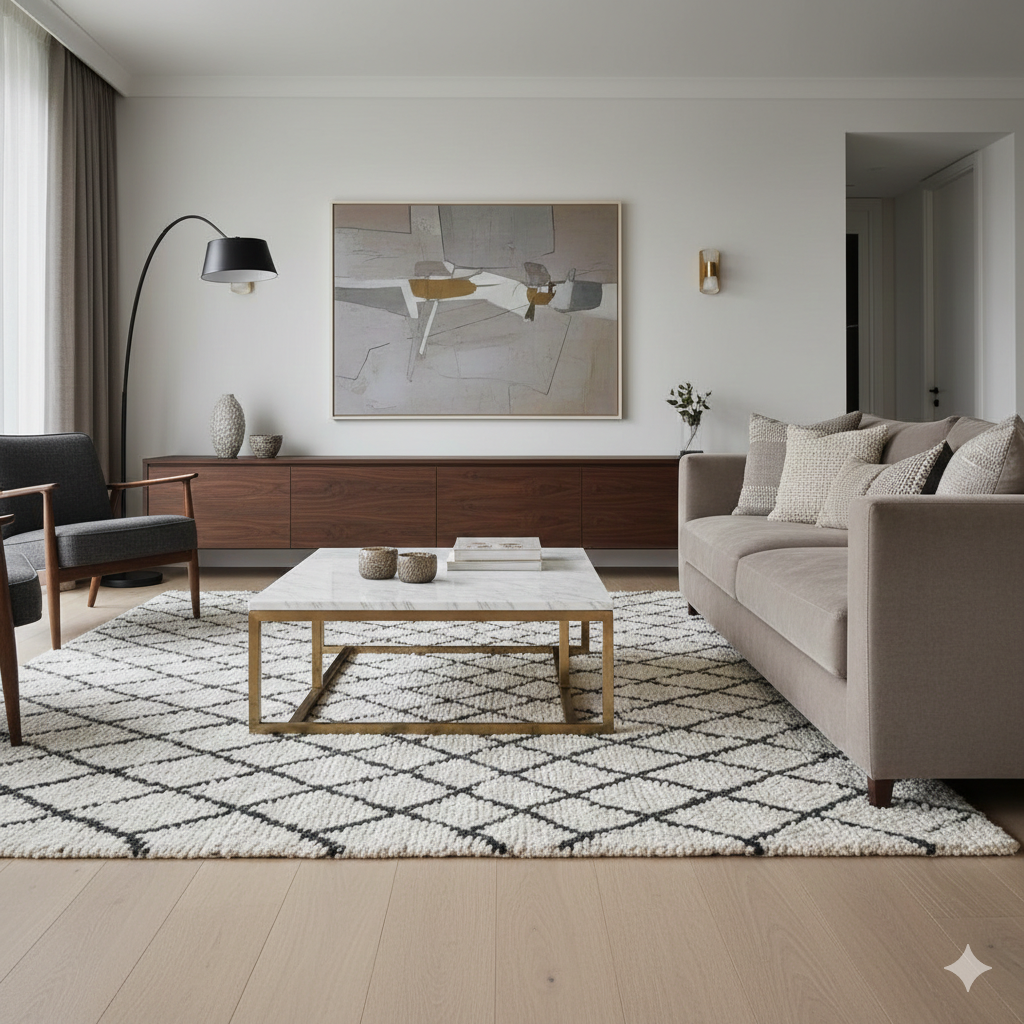
Professionals often design around a focal point, but they do not let the television dictate everything. A living room can prioritize conversation, views, or a fireplace, with media integrated thoughtfully. The most reliable arrangement strategy is to anchor seating with a correctly sized rug, then build a conversational grouping where key seats face each other rather than all facing forward.
Several dependable layout moves:
- Float the sofa when possible. Pulling it off the wall can improve proportion and create a more intentional zone.
- Use a triangle of reach between sofa, chairs, and coffee table so surfaces are practical, not ornamental.
- Prioritize sightlines so seated guests can see one another without twisting, and so the room’s best feature remains visible.
These are professional interior design tips disguised as common sense. They work because they address human behavior, not just aesthetics.
Visual Tricks to Make Any Room Look Bigger and Brighter
How to use scale, proportion, and negative space like a designer
Many people assume a small room needs small furniture. Designers often do the opposite: fewer, better-scaled pieces with breathing room around them. Oversized clutter is what makes a space feel tight—too many small items, too many competing patterns, too many surfaces covered at once.
Negative space is not emptiness; it is clarity. Leave margins around key pieces so the eye can rest. Choose one statement element, then support it with quieter companions. This is one of the most effective small space design ideas because it increases perceived volume without changing the footprint.
The mirror, curtain, and rug placement secrets that change everything
Mirrors work best when they reflect light or an attractive view, not a cluttered corner. Place them opposite a window or near a lamp to amplify brightness and add depth. Avoid undersized mirrors that look like afterthoughts; scale them to the wall or the furniture beneath.
Curtains should rarely stop at the window frame. Mounting drapery higher and wider than the window creates the illusion of height and generosity. Use enough width so curtains look full when closed and substantial when open.
Rug placement is equally transformative. A rug that is too small fractures the room into awkward pieces. Aim for a size that allows at least the front legs of major seating to sit on the rug, or ideally all legs in a cohesive seating area. This single adjustment can elevate a room more than a new accessory ever could.
Styling, Lighting, and Budget-Friendly Designer Tricks
Styling Secrets: How Designers Make Rooms Look Effortlessly Finished
Coffee table, shelf, and console styling formulas that always work
Professionals style with structure, then refine with editing. For a coffee table, the goal is a composition that feels layered and livable. If you are learning how to style a coffee table, start with three elements: something tall (a vase or candlestick), something grounded (a tray or stack of books), and something organic or personal (a small sculpture, bowl, or found object). The pieces should vary in height and texture, but share a unifying detail such as color temperature or material.
For shelves and consoles, designers alternate vertical and horizontal shapes, leaving deliberate gaps. They also “bookend” compositions with stronger shapes and keep the center visually calmer. The result is not maximalism; it is rhythm.
The rule of thirds and odd-number groupings designers swear by
The rule of thirds creates balance without symmetry. Whether you are hanging art, grouping objects, or arranging pillows, compositions tend to look more natural when visually divided into thirds rather than halves. Odd-number groupings—three or five—often read as curated instead of staged, especially when the items differ slightly in size.
The more important principle, however, is restraint. Professionals remove as much as they add. If a surface looks busy, subtract one element and reassess before buying anything new. Editing is one of the most overlooked interior design secrets because it costs nothing and changes everything.
Lighting Strategies Designers Don’t Spell Out
The three-layer lighting plan (ambient, task, accent) made simple
Rooms that feel “flat” are often under-lit or lit from a single source. Designers build light in layers. Ambient lighting provides general illumination (ceiling fixtures, recessed lighting). Task lighting supports activities (reading lamps, under-cabinet lighting). Accent lighting adds drama and dimension (picture lights, sconces, directional spots).
For effective lighting design for living room spaces, use at least two to three light sources at different heights—such as a floor lamp, table lamp, and a ceiling fixture or sconce. This reduces harsh shadows, improves comfort, and makes the room more flattering at night.
How pros choose bulb temperature and brightness for each room
Bulb temperature shapes mood. Warm light tends to feel inviting in living rooms and bedrooms, while neutral-to-cool light can be useful for kitchens, baths, and work areas where clarity matters. Consistency also matters: mixing wildly different color temperatures in one open space can make finishes look mismatched and skin tones appear dull.
Brightness is equally strategic. Professionals consider lumens, not just wattage equivalents, and they often put lights on dimmers to adapt the room from day to evening. If you invest in one upgrade that immediately improves perceived quality, make it dimmable, well-placed lighting.
Money-Saving Hacks and Common Mistakes Designers Avoid
Where Designers Splurge vs. Save (and Why It Matters)
The investment pieces that instantly elevate a room
Designers splurge on items that anchor the room and take daily wear: a well-made sofa, a quality mattress, a durable dining table, or a substantial rug. These pieces affect comfort, longevity, and the room’s silhouette. When the anchor is right, everything else looks more credible.
They also invest in craftsmanship where it is visible up close—hardware, faucets, and lighting fixtures—because these details signal quality. This is not extravagance; it is targeted spending that supports the room’s overall integrity.
Budget swaps that still look high-end in photos and in person
Budget-friendly interior design is most effective when you save on items that are easy to upgrade later. Side tables, decorative mirrors, and accessories can be sourced affordably, especially if you focus on shape and scale rather than brand. Painted furniture can look bespoke with the right color and hardware. Ready-made curtains can look custom when properly hung and adequately full.
Another professional approach is to buy fewer accessories, but choose larger ones. One substantial vase will look more expensive than several small trinkets. Scale often reads as luxury.
Costly Design Mistakes Professionals Never Make
Scale, placement, and proportion errors that cheapen your space
Many common interior design mistakes fall into three categories: undersized rugs, art hung too high, and furniture that is either too bulky or too delicate for the room. Another frequent error is pushing every piece against the wall, which creates a perimeter effect and leaves the center feeling disconnected.
Lighting mistakes are equally costly: relying solely on overhead fixtures, choosing bulbs with mismatched temperatures, or using fixtures that are too small for the scale of the space. These issues subtly undermine even well-chosen furniture.
How to test ideas before committing to paint, furniture, or layout
Professionals test before they commit. Paint should be sampled in multiple areas and observed throughout the day; the same color can look markedly different in morning coolness and evening warmth. For furniture, use painter’s tape to outline dimensions on the floor, or temporarily swap in existing pieces to validate scale and circulation.
For layout changes, stage the room for a week before purchasing anything. Live with the arrangement, walk the paths, and notice what feels obstructed. This simple trial period prevents expensive missteps and is one of the most practical interior design secrets for homeowners who want confident results.
Conclusion
A polished home is not the product of a single perfect purchase. It is the result of planning that respects function, color choices guided by proportion, lighting built in layers, and styling that values restraint as much as beauty. When you apply these professional interior design tips—measuring before buying, balancing with the 70-20-10 rule, improving flow, and mastering a few home styling tricks—you begin to design with intention rather than impulse. The outcome is not a showroom. It is something better: a space that looks refined, feels effortless, and supports the way you actually live.
How Interior Design Influences Mood and Productivity
Interior Design Trends You’ll See Everywhere This Year
The Best Workout Playlists for Motivation
https://www.teepublic.com/t-shirt/50086695-old-car-in-the-desert?store_id=2851997
Zoo-doku